 Over the last few years, the concept of “Big data” has become ubiquitous. Big data refers to the rapid growth and availability of data, both structured and unstructured that can be analyzed to enable smarter business decision making. Most discussions assume that big data applies only to large enterprises or federal government organizations trying to cope with massive volumes of data. While volume can often be one component, a more useful way to approach big data is as data that can’t be managed or analyzed by traditional technologies such as simple databases, spreadsheets or KPI charts-and-graphics dashboards.
Sources of Big Data
Sources for big can be almost anything: Foursquare checkins, embedded roadway sensors, Internet of Things (IoT) devices, energy performance modeling, transportation management, facilities and asset management – the list is endless. Many (most) of these involve physical assets or people that can be tied to a geospatial, location-based component such as a street address, census block or GPS coordinates.
Geospatial Visualization of Big Data
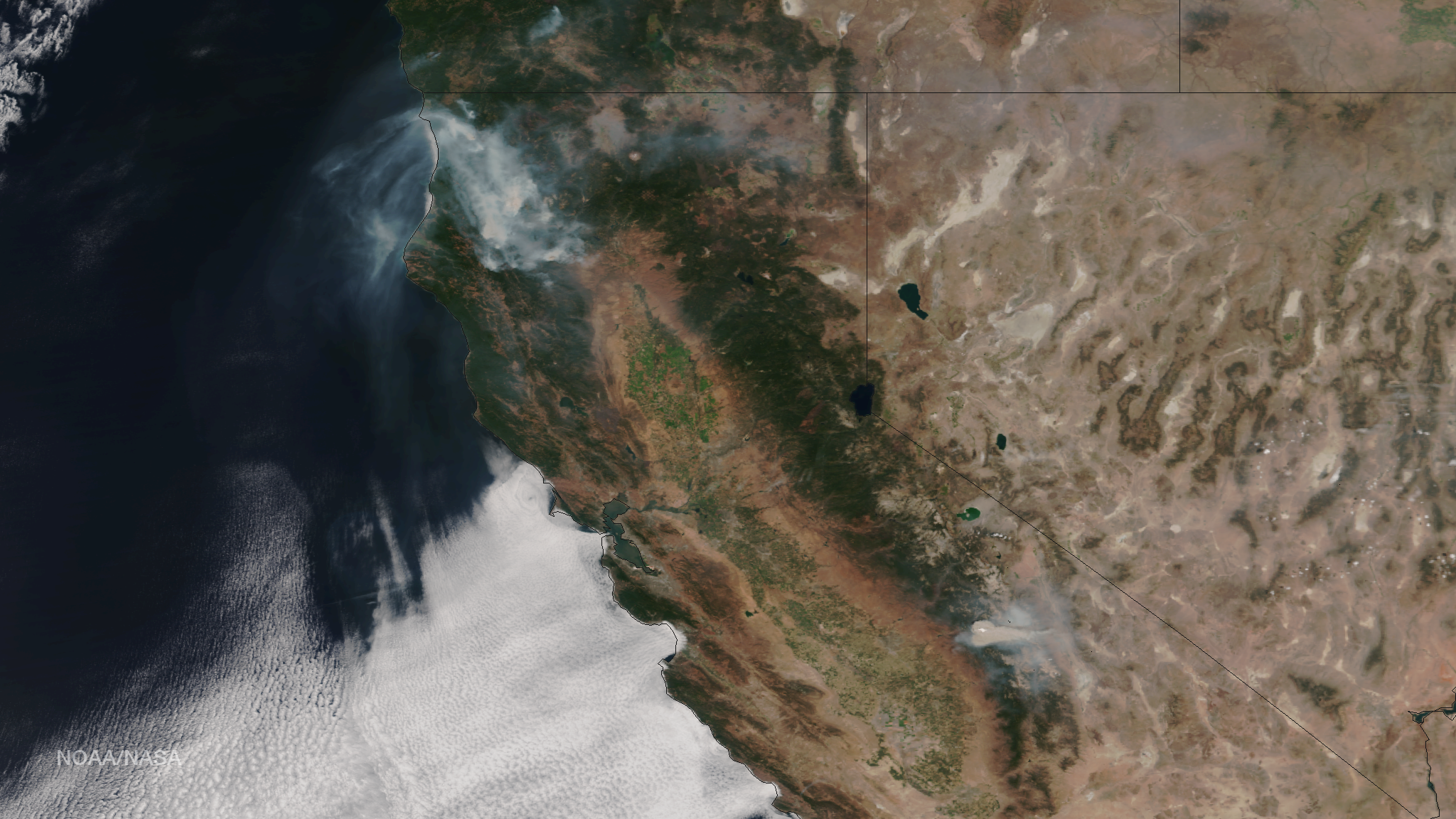
Wrapping your brain around disparate or unstructured or voluminous amounts of data – the essence of big data – can be challenging. Geospatial visualization and GIS data mapping are effective ways to make it all much easier. A map can be worth a thousand words, especially when you are trying to find relationships and see patterns in big data. A spreadsheet or traditional DB query can require a specialist, but a geospatial visualization or location-based dashboard conveys information in a universal manner that offers a shorter route to decision making and critical data analysis. Maps also make it simple to share ideas with others. It lets people ask, “Do you see what I see?” or “What would happen if we put a new building/transmission line/on-ramp/etc. here?” or “Where is insurance risk greatest given X?”
Importantly, to be truly actionable, geospatial visualizations need to be interactive as well as well-designed, understandable and easy-to-use. Touch interfaces, natural language queries, easy drill-downs and familiar map interfaces (e.g. Google Maps) are all important. The open source Arches project is a good example of interactive geospatial visualization to manage and analyze diverse assets and unstructured data.
Semantic Models
One of the challenges with big data is connecting disparate data sets. Systems often don’t talk to each other. But location is a common denominator that can unite data warehouses. Semantic data models embedded in geospatial representations of assets can greatly facilitate GIS as a way to analyze big data. Semantic models can correlate things in the physical world (tangible assets such as a network of pipes, electricity transmission lines, locations of competitor’s business, etc.) with other kinds of data that describe the operations of a business (e.g financial systems). Visualizing these elements and looking for relationships can be the key to new insights.
The Internet of Things (IoT) and Machine-to-Machine (M2M) Communication
Semantic data models are also relevant to the ever increasing volume of location-based machine data (e.g. from sensor/IoT networks). Semantic data models can track relationships among multiple material things and management systems and potentially communicate with each other automatically for things like supply chain management and maintenance.
Putting it all together
In many organizations, stakeholders can look at assets, they can look at customers, they can look at sales, they can look at deployments, they can look at unstructrued data, etc. But tying it all together using traditional tools can be problematic. This is the challenge of big data. Even when you know what you are looking for, sifting through large volumes of information in search of the most relevant pieces and related content can leave analytic blind spots. Geo-enriched data and semantically enhanced geospatial visualization can provide a good foundation to isolate patterns and see data in more interesting and useful ways to make faster and better-informed strategic, managerial and operational decisions.


